
Shopify Multi-Blocks Section – Dynamic & Customizable
Create a fully customizable multi-blocks section for your Shopify store. Supports background colors, images, overlays, and links for engaging navigation. Mobile-friendly & interactive.
Liquid Code
<!--
========================================
Section Name: Multi-Blocks Section
Tech Stack: Liquid, HTML, CSS, JavaScript
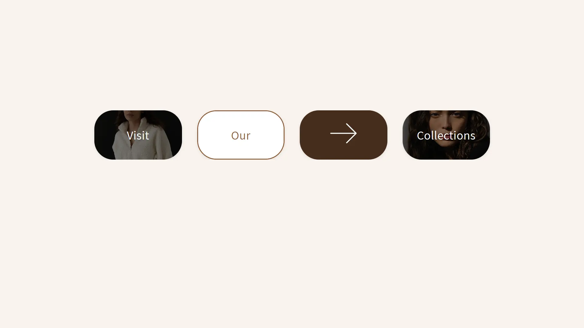
What This Section Does:
- Displays multiple interactive blocks with customizable backgrounds, overlays, and text.
- Allows linking blocks to different pages with new tab or same tab options.
- Supports both text and arrow indicators for flexible layouts.
- Fully responsive for seamless mobile and desktop experiences.
Promotion:
Enhance your Shopify store with a visually engaging multi-blocks section. Built for navigation, promotions, and category highlights. Get it now at [PrebuiltTemplates](https://prebuilttemplates.com/).
========================================
-->
<section class="custom-multi-blocks" style="background-color: {{ section.settings.background_color }}; padding: {{ section.settings.padding_top }}px 0 {{ section.settings.padding_bottom }}px;">
<div class="custom-multi-blocks-container page-width" >
{% for block in section.blocks %}
<div class="custom-multi-block-wrap">
<a
class="custom-multi-block"
href="{{ block.settings.block_link }}"
target="{{ block.settings.link_target }}"
style="
{% if block.settings.border_enabled %}
border: 3px solid {{ block.settings.border_color }};
{% endif %}
">
{% if block.settings.block_background_type == 'color' %}
<div class="block-content" style="background-color: {{ block.settings.block_background_color }};">
{% else %}
<div class="block-content" style="background-image: url({{ block.settings.block_background_image | img_url: 'master' }}); background-size: cover; background-position: center;">
{% endif %}
<div class="overlay" style="background-color: {{ block.settings.overlay_color }}; opacity: {{ block.settings.overlay_opacity }};"></div>
{% if block.settings.show_arrow %}
<div class="arrow-svg">
<svg viewBox="0 0 24.00 24.00" fill="none" xmlns="http://www.w3.org/2000/svg"><g id="SVGRepo_bgCarrier" stroke-width="0"></g><g id="SVGRepo_tracerCarrier" stroke-linecap="round" stroke-linejoin="round"></g><g id="SVGRepo_iconCarrier"> <path d="M4 12H20M20 12L14 6M20 12L14 18" stroke="#ffffff" stroke-width="0.672" stroke-linecap="round" stroke-linejoin="round"></path> </g></svg>
</div>
{% else %}
<span class="block-text" style="color: {{ block.settings.text_color }};">{{ block.settings.block_text }}</span>
{% endif %}
</div>
</a>
</div>
{% endfor %}
</div>
</section>
<style>
.custom-multi-blocks {
display: flex;
justify-content: center;
align-items: center;
width: 100%;
}
.custom-multi-blocks-container {
display: grid;
gap: 40px;
justify-content: center;
align-items: center;
grid-template-columns: repeat(auto-fit,minmax(200px, 1fr));
flex-wrap: wrap;
}
.custom-multi-block .block-content .arrow-svg svg {
width: 100px;
}
.custom-multi-block {
aspect-ratio: 3 / 2;
border-radius: 50px;
width: 230px;
max-width: 100%;
overflow: hidden;
box-shadow: 0 2px 8px rgba(0, 0, 0, 0.1);
position: relative;
display: flex;
height: 130px;
text-decoration: none;
}
.custom-multi-block .block-content {
display: flex;
justify-content: center;
align-items: center;
width: 100%;
height: 100%;
text-align: center;
border-radius: 20px;
position: relative;
}
.custom-multi-block .block-content .block-text {
font-size: 18px;
font-weight: 100;
z-index: 2;
padding: 10px 20px;
border-radius: 10px;
font-size: 32px;
display: flex;
align-items: center;
justify-content: center;
color: inherit;
}
.custom-multi-block-wrap {
display: flex;
justify-content: center;
}
.custom-multi-block .block-content .overlay {
position: absolute;
top: 0;
display:block;
left: 0;
width: 100%;
height: 100%;
z-index: 1;
border-radius: 20px;
}
.custom-multi-block .block-content .arrow-svg {
z-index: 2;
}
.custom-multi-blocks-container.page-width {
overflow: hidden;
}
@media(max-width:749px){
.custom-multi-block {
width: 100%;
height: 80px;
}
.custom-multi-blocks-container {
gap: 20px;
}
}
</style>
{% schema %}
{
"name": "Custom Multi-Blocks",
"settings": [
{
"type": "color",
"id": "background_color",
"label": "Section Background Color",
"default": "#f9f4ee"
},
{
"type": "range",
"id": "padding_top",
"label": "Padding Top",
"default": 50,
"min": 0,
"max": 200,
"step": 2
},
{
"type": "range",
"id": "padding_bottom",
"label": "Padding Bottom",
"default": 50,
"min": 0,
"max": 200,
"step": 2
}
],
"blocks": [
{
"type": "block",
"name": "Block",
"settings": [
{
"type": "select",
"id": "block_background_type",
"label": "Background Type",
"options": [
{
"value": "color",
"label": "Background Color"
},
{
"value": "image",
"label": "Background Image"
}
],
"default": "color"
},
{
"type": "color",
"id": "block_background_color",
"label": "Background Color",
"default": "#8c5b38",
"info": "This will be used if 'Background Color' is selected."
},
{
"type": "image_picker",
"id": "block_background_image",
"label": "Background Image",
"info": "This will be used if 'Background Image' is selected."
},
{
"type": "color",
"id": "overlay_color",
"label": "Overlay Color",
"default": "#000000",
"info": "Color of the overlay."
},
{
"type": "range",
"id": "overlay_opacity",
"label": "Overlay Opacity",
"default": 0.5,
"min": 0,
"max": 1,
"step": 0.1
},
{
"type": "text",
"id": "block_text",
"label": "Block Text",
"default": "Sample Text"
},
{
"type": "color",
"id": "text_color",
"label": "Text Color",
"default": "#ffffff",
"info": "Set the color of the block text."
},
{
"type": "checkbox",
"id": "show_arrow",
"label": "Show Arrow Instead of Text",
"default": false
},
{
"type": "checkbox",
"id": "border_enabled",
"label": "Enable Border",
"default": false
},
{
"type": "color",
"id": "border_color",
"label": "Border Color",
"default": "#000000",
"info": "This will be used if 'Enable Border' is checked."
},
{
"type": "url",
"id": "block_link",
"label": "Block Link"
},
{
"type": "select",
"id": "link_target",
"label": "Link Target",
"options": [
{
"value": "_self",
"label": "Same Tab"
},
{
"value": "_blank",
"label": "New Tab"
}
],
"default": "_self"
}
]
}
],
"presets": [
{
"name": "Multi Blocks",
"category": "Custom Sections"
}
]
}
{% endschema %}