
How to Transform Your Shopify 404 Page Into a Sales-Boosting Opportunity

Table of Contents
Is your Shopify 404 page a dead-end? Turn lost visitors into loyal customers! Discover 5 proven strategies to make your error page engaging, reduce bounce rates, and boost sales. Don’t let broken links hurt your business—learn how to optimize your 404 page now!.
Why Should You Care About a Boring Old 404 Page?
No matter how much effort you put into maintaining your Shopify store, broken links are inevitable. Products sell out, URLs change, or sometimes customers just mistype an address.
And here’s the bad news—when visitors land on a standard, uninspiring error page, 88% of them will leave immediately. That’s lost customers and lost sales.
The good news? A well-optimized 404 page can reduce bounce rates by up to 40%, keeping shoppers on your site longer and even helping your SEO rankings. Google notices when people leave your site too quickly, and that can hurt your position in search results. A smartly designed 404 page signals that your store provides a great user experience—even when things go wrong.
How to Update Your Shopify 404 Page (It’s Easier Than You Think!)
Fixing your 404 page is easier than you think. Shopify lets you customize it, and there are even drag-and-drop apps that make the process a breeze. So, no need to worry about coding—just follow these simple steps to turn your error page into a powerful sales tool.
For the DIY approach:
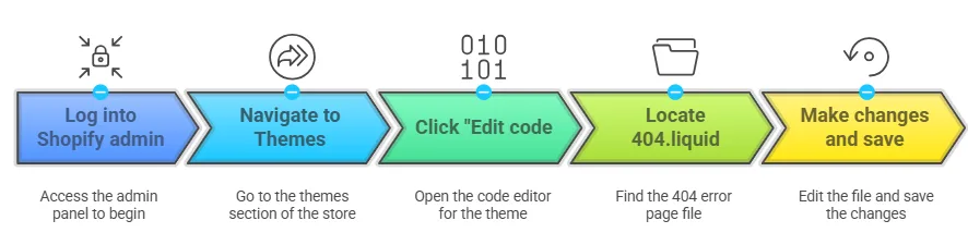
Not comfortable with code? No worries! There are several Shopify apps with drag-and-drop 404 page builders that make this super simple.
5 Ways to Make Your 404 Page Actually Work For You
Alright, so how do we fix this? I’ve looked at hundreds of Shopify stores and found five strategies that really work. Here’s how the best online stores turn their error pages from duds into heroes:
| Strategy | Why It Works | Difficulty Level |
|---|---|---|
| Talk Like a Human, Not a Robot | Creates instant connection | Super easy |
| Keep Your Brand Vibe Consistent | Builds trust even during errors | Pretty straightforward |
| Give Clear “Next Step” Options | Prevents dead-end feelings | Medium effort |
| Add a Search Bar | Lets customers find what they wanted | Quick win |
| Sprinkle in Some Personality | Makes a frustrating moment memorable | Fun but requires thought |
NOTE: For more information also check out this blog https://app.uxcel.com/tutorials/11-best-practices-for-designing-404-pages-656
1. Skip the Robot Talk—Be Human!
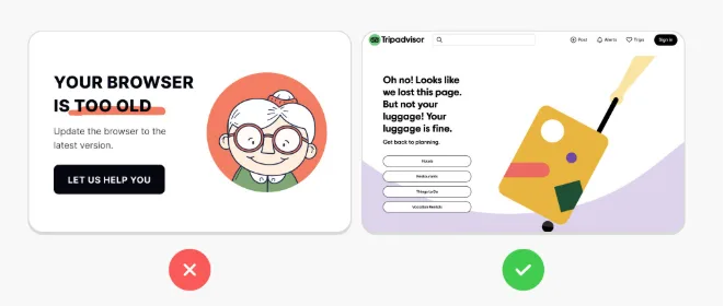
Ever clicked a link expecting something great, only to be met with a cold, robotic error message? Something like:
🚫 “404 ERROR: PAGE NOT FOUND.”
✅ “Uh-oh! This page must have wandered off. But don’t worry, we’ve got plenty of awesome finds waiting for you!”
See the difference? One feels like a dead end, while the other reassures visitors and invites them to stay. A little warmth and personality can turn a frustrating moment into a pleasant surprise!
2. Keep Your Brand Looking Consistent
Have you ever clicked a link and suddenly felt like you’ve been transported to a completely different website? That jarring experience destroys trust.
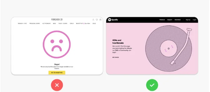
To keep it seamless and visually appealing, make sure your 404 page mirrors the rest of your website. A familiar look reassures visitors and encourages them to keep exploring instead of leaving your store.
- Use your brand’s colors and fonts
- Include your logo prominently
- Make sure it looks and feels like the rest of your site
When your 404 page feels familiar, customers are more likely to stay and explore
3.Give Clear “Next Step” Options
Ever gotten lost and wished for a sign pointing you in the right direction? That’s exactly what your 404 page should do.
Instead of leaving visitors stranded, give them easy ways to continue shopping:
- Highlight bestsellers – Show them what’s popular!
- Navigation buttons – Link to main categories.
- A big homepage button – Make it easy to start fresh.
- Promote special offers – Turn a mistake into a sales opportunity!
🔹 Example: Lululemon’s 404 page doesn’t just say “oops.” It shows visitors product categories with images, making it easy to keep shopping.
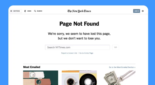
4. Add a Search Bar
Sometimes, visitors know exactly what they’re looking for—they just can’t find it. A search bar on your 404 page lets them quickly get back on track.
✅ Make sure it’s big and easy to find
✅ Use friendly text like “Find your next favorite item”
✅ Ensure it actually delivers useful results
Stores that add a search bar to their 404 pages see 30% fewer people leaving immediately. It’s a simple fix with a big impact.
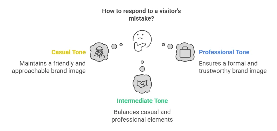
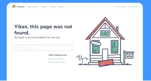
5. Add Personality
A touch of humor or personality can totally diffuse the frustration of hitting a dead end. But—and this is important—remember that customers who reach error pages might already be annoyed.
Some ideas that work well:
A little humor or creativity can make an otherwise frustrating moment feel fun and engaging. Some ideas:
- Pet store? Show a puppy hiding under a blanket with “Oops! This page is playing hide and seek.”
- Tech store? Try a geeky reference like “You found a glitch in the matrix. Let’s get you back on track!”
- Fashion brand? “Looks like this page is out of style, but these items aren’t!”
🔹 Example: GitHub’s 404 page features a Star Wars reference that speaks directly to their audience. It’s fun, on-brand, and keeps users engaged.
PRO TIP : ERROR PAGES CAN BE MODIFIED BUT ITS IMPOTANT TO FIX THE BACK LINKS AND HAVE A SMOOTH WEBSITE FLOW, TO GET GUIDENCE ABOUT THIS TOPIC , TAKE THE HELP OF https://prebuilttemplates.com/blog/a-complete-guide-to-fix-broken-links/
Real Brands Doing 404 Pages Right
Brands That Nail Their 404 Pages
| Brand | Why It Works |
|---|---|
| Lululemon | Showcases product categories with images to drive sales |
| Airbnb | Features an engaging animation of a lost traveler to stay on-brand |
| Disney | Uses beloved characters “searching” for the page to keep visitors entertained |
| Shopify | Includes a friendly mascot with clear navigation to guide users |
| GitHub | Uses humor and pop culture references that resonate with their audience |
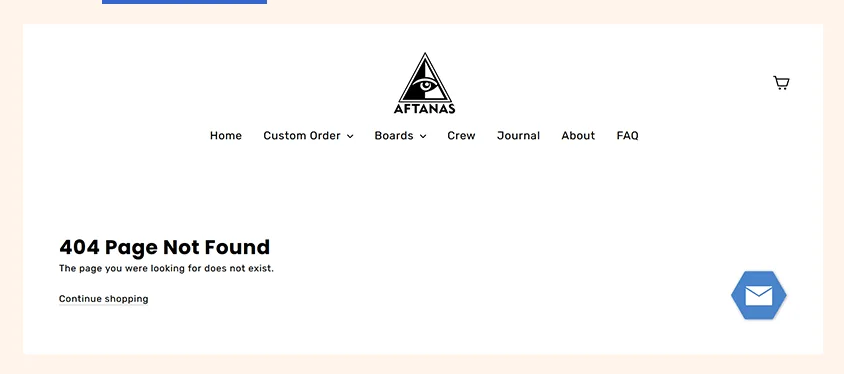
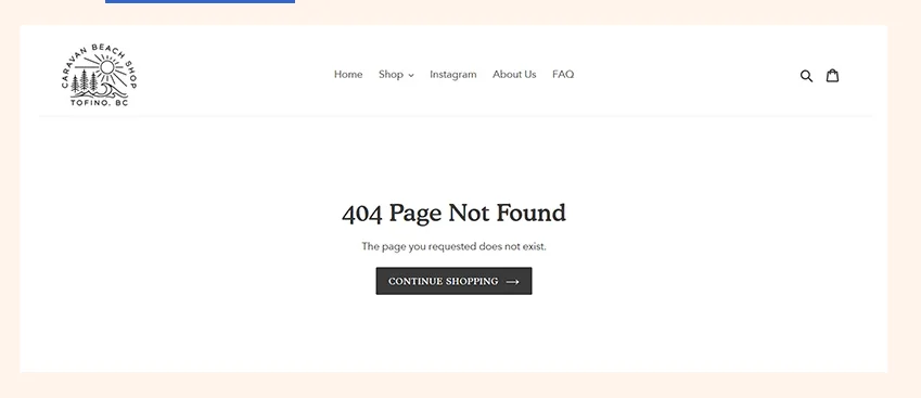
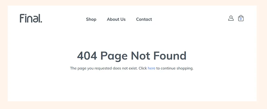
Check out brands like Aftanas Surfboards, Caravan Beach Shop, and Final.co for more creative examples.
Some of the examples:
3: Final.co
Don’t Forget Mobile Users!
More than 60% of online shopping happens on mobile, so your 404 page needs to work smoothly on all devices.
A few mobile must-haves:
| Element | Why It Matters | Fix |
| Tap-friendly buttons | Tiny buttons frustrate users | Make them at least 44px × 44px |
| Readable text | Small fonts make users squint | Use at least 16px font size |
| Fast loading | Slow pages make users leave | Optimize images & scripts |
| Vertical layout | Side-scrolling is annoying | Stack elements for easy navigation |
Test your 404 page on different devices to make sure it’s easy to use everywhere.
Got Questions? I’ve Got Answers!
How often should I check my store for broken links?
I recommend doing a quick scan monthly. Tools like Google Search Console or broken link checkers can make this super easy.
Can my 404 page actually help my SEO?
Absolutely! When your error page keeps people on your site instead of bouncing back to Google, that sends positive signals about your site quality.
Should I include my contact info on the 404 page?
You can add a small “Report this broken link” option, but don’t make it the main focus—priority should be getting them shopping again.
Is it better to redirect old URLs or use a custom 404 page?
Both have their place! Use 301 redirects for pages that have permanently moved (like renamed products). Your custom 404 page catches everything else.
How can I see how many people hit my 404 page?
Set up event tracking in Google Analytics to monitor these views. This data helps you spot problem areas in your site that need fixing.
Let’s Wrap This Up: Small Change, Big Impact
Your 404 page might not be top of mind, but a simple update can keep visitors engaged, improve SEO, and even drive sales.
Here’s your challenge:
1️⃣ Type a random URL after your domain (e.g., yourstore.com/xyz123).
2️⃣ Look at your 404 page. Does it help visitors or push them away?
3️⃣ Use the strategies in this guide to turn your error page into an opportunity!
🚀 Your store’s success is in the details. Start optimizing your 404 page today!.