
Shopify Feature Highlights Section – Interactive & Responsive
Enhance your Shopify store with an interactive feature highlights section. Showcase product benefits with icons and a centered product image. Fully customizable and mobile-friendly.
Liquid Code
<!--
========================================
Section Name: Feature Highlights
Tech Stack: Liquid, HTML, CSS, JavaScript
What This Section Does:
- Displays a product image in the center with surrounding feature blocks.
- Uses Liquid to dynamically load feature icons and descriptions.
- Fully responsive design that adapts to different screen sizes.
- Supports placeholder images when no images are uploaded.
Promotion:
Boost engagement and improve conversions with this Shopify Feature Highlights section! Perfect for showcasing product benefits dynamically. Available at [PrebuiltTemplates](https://prebuilttemplates.com/).
========================================
-->
<section class="custom-feature-section" style="background-color: {{ section.settings.background_color }}; padding: {{ section.settings.padding_top }}px 0 {{ section.settings.padding_bottom }}px;">
<div class="feature-container page-width">
<!-- Top Section: Rich Text -->
<div class="feature-text">
{{ section.settings.feature_richtext }}
</div>
<!-- Bottom Section: Center Image & Feature Blocks -->
<div class="feature-layout">
<!-- Center Product Image -->
<div class="feature-center-image">
{% if section.settings.center_image %}
<img src="{{ section.settings.center_image | img_url: 'large' }}" alt="Product Image">
{% else %}
{{ 'product-1' | placeholder_svg_tag: 'feature-placeholder' }}
{% endif %}
</div>
<!-- Feature Blocks (Surrounding Features) -->
{% for block in section.blocks %}
<div class="feature-block feature-{{ forloop.index }}">
{% if block.settings.feature_icon %}
<img src="{{ block.settings.feature_icon | img_url: 'small' }}" alt="Feature Icon">
{% else %}
{{ 'image' | placeholder_svg_tag: 'feature-icon-placeholder' }}
{% endif %}
<p>{{ block.settings.feature_text }}</p>
</div>
{% endfor %}
</div>
</div>
</section>
<style>
/* Section Layout */
.custom-feature-section {
text-align: center;
width: 100%;
position: relative;
overflow: hidden;
padding: 50px 0;
}
/* Feature Text (Top Section) */
.feature-text {
max-width: 800px;
margin: 0 auto 40px auto;
font-size: 20px;
color: #fff;
line-height: 1.5;
}
/* Feature Layout (Bottom Section) */
.feature-layout {
display: flex;
flex-wrap: wrap;
justify-content: center;
align-items: center;
position: relative;
max-width: 1000px;
margin: auto;
}
/* Center Image */
.feature-center-image {
width: 320px;
height: 320px;
display: flex;
align-items: center;
justify-content: center;
position: relative;
background: rgba(255, 255, 255, 0.05);
border-radius: 50%;
padding: 20px;
}
.feature-center-image img {
width: 100%;
height: auto;
max-width: 100%;
border-radius: 50%;
}
/* Feature Blocks */
.feature-block {
position: absolute;
border-radius: 8px;
display: flex;
align-items: center;
gap: 10px;
color: #fff;
font-size: 16px;
font-weight: bold;
text-align: left;
transition: transform 0.3s ease;
}
/* Feature Icon */
.feature-block img {
width: 28px;
height: 28px;
}
/* Feature Positions */
.feature-1 { top: 10%; left: 5%; transform: translateX(-50%); }
.feature-2 { top: 30%; left: 0%; transform: translateX(-100%); }
.feature-3 { bottom: 30%; left: 0%; transform: translateX(-100%); }
.feature-4 { bottom: 10%; left: 5%; transform: translateX(-50%); }
.feature-5 { top: 10%; right: 5%; transform: translateX(50%); }
.feature-6 { top: 30%; right: 0%; transform: translateX(100%); }
.feature-7 { bottom: 30%; right: 0%; transform: translateX(100%); }
.feature-8 { bottom: 10%; right: 5%; transform: translateX(50%); }
.feature-block p {
margin: 0;
font-size: 18px;
font-weight: 400;
}
/* Responsive Layout */
@media (max-width: 1024px) {
.feature-text {
font-size: 18px;
}
}
@media(max-width:1406px){
.feature-layout {
max-width: 680px;
}
}
@media(max-width:1064px){
.feature-layout {
max-width: 450px;
}
.feature-center-image {
width: 220px;
height: 220px;
}
}
@media(max-width:828px){
.feature-center-image {
width: 130px;
height: 130px;
}
.feature-block p {
font-size: 12px!important;
}
.feature-layout {
max-width: 343px;
}
/* Feature Positions */
.feature-1 { top: -10%; left: 5%; transform: translateX(-50%); }
.feature-2 { top: 20%; left: 0%; transform: translateX(-100%); }
.feature-3 { bottom: 30%; left: 0%; transform: translateX(-100%); }
.feature-4 { bottom: -10%; left: 5%; transform: translateX(-50%); }
.feature-5 { top: -10%; right: 5%; transform: translateX(50%); }
.feature-6 { top: 30%; right: 0%; transform: translateX(100%); }
.feature-7 { bottom: 20%; right: 0%; transform: translateX(100%); }
.feature-8 { bottom: -10%; right: 5%; transform: translateX(50%); }
}
/* Mobile View */
@media (max-width: 768px) {
.feature-text {
font-size: 16px;
margin-bottom: 70px;
}
.feature-layout {
flex-direction: column;
}
.feature-center-image {
width: 220px;
height: 220px;
}
.feature-block {
flex-direction: column;
align-items: center;
text-align: center;
font-size: 14px;
}
.feature-block img {
width: 24px;
height: 24px;
}
}
.feature-center-image svg.feature-placeholder , svg.feature-icon-placeholder{
filter: invert(1);
}
svg.feature-icon-placeholder {
width: 60px;
height: 40px;
}
@media(max-width:657px){
.feature-layout {
max-width: 185px;
}
/* Feature Positions */
.feature-1 { top: -40%; left: 5%; transform: translateX(-50%); }
.feature-2 { top: 5%; left: 0%; transform: translateX(-100%); }
.feature-3 { bottom: 3%; left: 0%; transform: translateX(-100%); }
.feature-4 { bottom: -30%; left: 5%; transform: translateX(-50%); }
.feature-5 { top: -40%; right: 5%; transform: translateX(50%); }
.feature-6 { top: 3%; right: 0%; transform: translateX(100%); }
.feature-7 { bottom: 5%; right: 0%; transform: translateX(100%); }
.feature-8 { bottom: -30%; right: 5%; transform: translateX(50%); }
.feature-center-image {
width: 130px;
height: 130px;
}
}
</style>
{% schema %}
{
"name": "Feature Highlights",
"settings": [
{
"type": "richtext",
"id": "feature_richtext",
"label": "Feature Description",
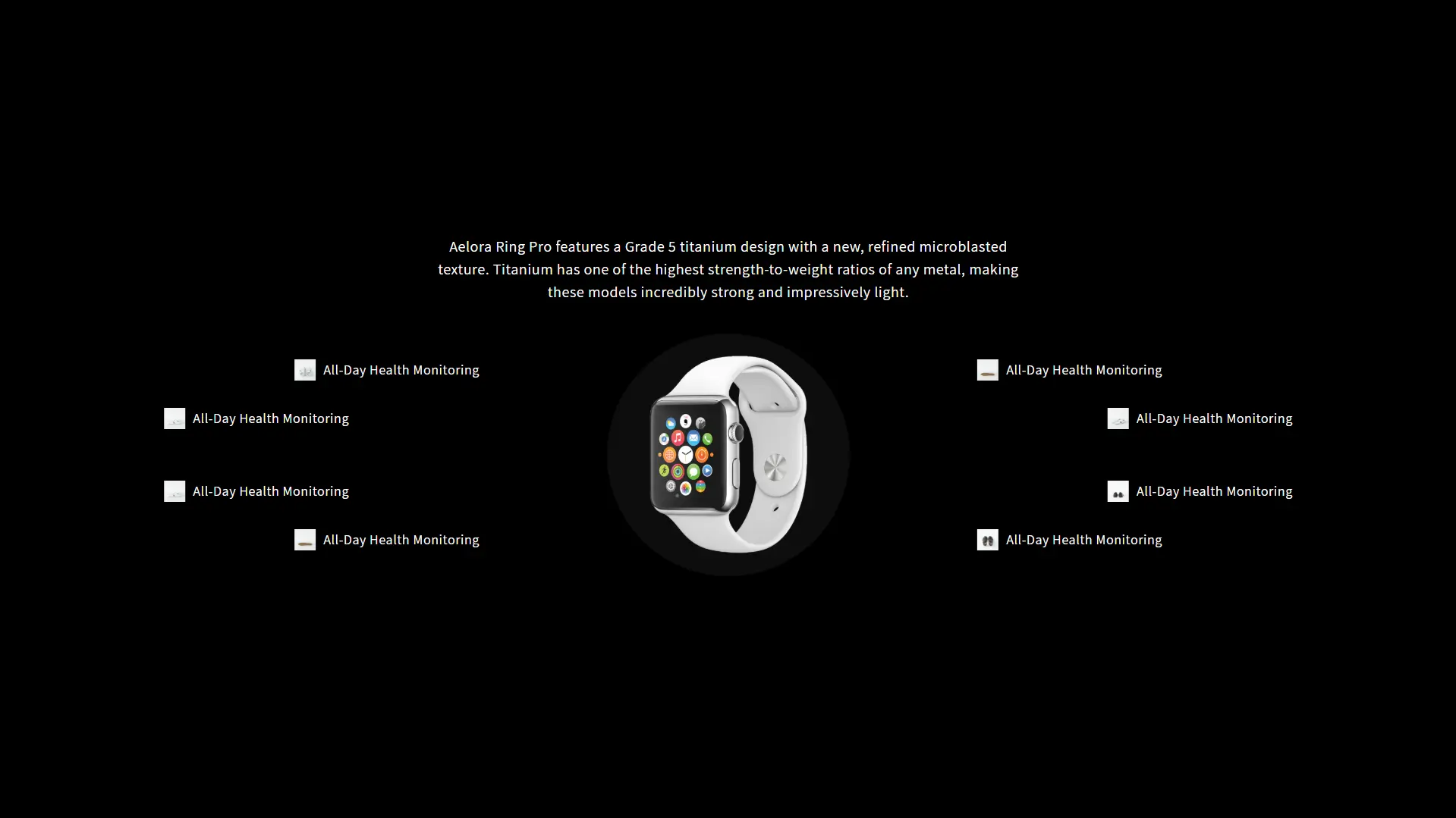
"default": "<p>Aelora Ring Pro features a Grade 5 titanium design with a new, refined microblasted texture. Titanium has one of the highest strength-to-weight ratios of any metal, making these models incredibly strong and impressively light.</p>"
},
{
"type": "image_picker",
"id": "center_image",
"label": "Center Product Image"
},
{
"type": "color",
"id": "background_color",
"label": "Background Color",
"default": "#000000"
},
{
"type": "range",
"id": "padding_top",
"label": "Padding Top",
"default": 50,
"min": 0,
"max": 200,
"step": 5
},
{
"type": "range",
"id": "padding_bottom",
"label": "Padding Bottom",
"default": 50,
"min": 0,
"max": 200,
"step": 5
}
],
"blocks": [
{
"type": "feature",
"name": "Feature Item",
"settings": [
{
"type": "image_picker",
"id": "feature_icon",
"label": "Feature Icon"
},
{
"type": "text",
"id": "feature_text",
"label": "Feature Text",
"default": "All-Day Health Monitoring"
}
]
}
],
"presets": [
{
"name": "Feature Highlights",
"category": "Custom Sections",
"blocks": [
{ "type": "feature" },
{ "type": "feature" },
{ "type": "feature" },
{ "type": "feature" },
{ "type": "feature" },
{ "type": "feature" }
]
}
]
}
{% endschema %}