
Shopify Featured Products Grid – Customizable Product Display
Add a responsive grid of featured products to your Shopify store with customizable layout, product cards, and interactive elements. Perfect for showcasing bestsellers, new arrivals, or promotional items.
Liquid Code
<!--
========================================
Section Name: Featured Products Grid
Tech Stack: Liquid, HTML, CSS, JavaScript
What This Section Does:
- Displays a customizable grid of featured products from selected collections.
- Features product cards with images, titles, prices, and optional variant selectors.
- Includes hover effects, quick view functionality, and add-to-cart buttons.
- Fully responsive design with adjustable columns for different screen sizes.
Promotion:
Showcase your best products with an attractive and functional grid layout. Increase conversions with interactive product cards and seamless shopping experience. Get it now at [PrebuiltTemplates](https://prebuilttemplates.com/).
========================================
-->
{% comment %}
Section: Custom Product Grid
A responsive grid of products with a central promotional banner
{% endcomment %}
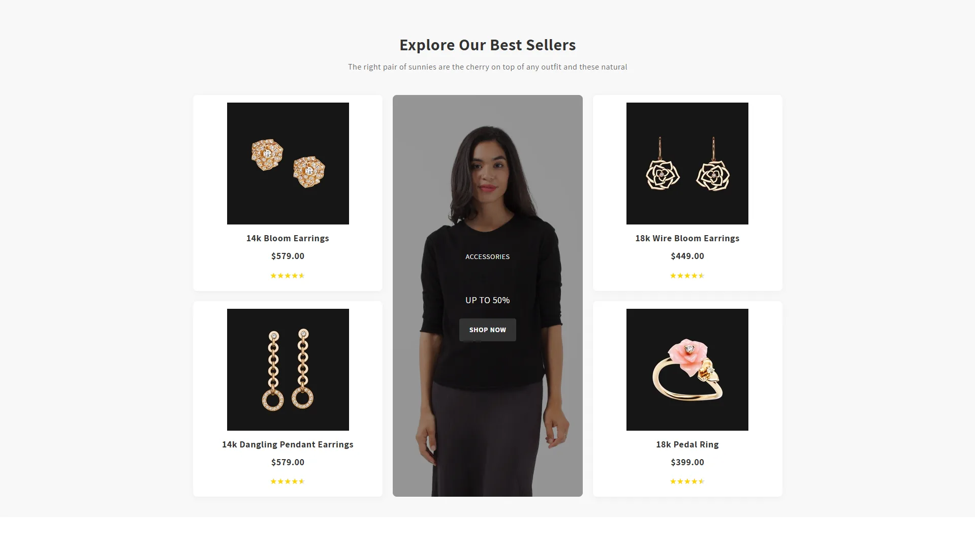
<section class="product-grid-section-{{ section.id }}" style="background-color: {{ section.settings.bg_color }}; padding: {{ section.settings.pad_top }}px 0 {{ section.settings.pad_bot }}px;">
<div class="product-grid-container page-width">
{% if section.settings.title != blank %}
<h2 class="product-grid-heading">{{ section.settings.title }}</h2>
{% endif %}
{% if section.settings.subtitle != blank %}
<div class="product-grid-subtitle">{{ section.settings.subtitle }}</div>
{% endif %}
<div class="product-grid-layout">
{% assign product_blocks = section.blocks | where: "type", "product" %}
{% assign left_side_products = product_blocks | slice: 0, 2 %}
{% assign right_side_products = product_blocks | slice: 2, 2 %}
<!-- Left Side Products -->
<div class="product-grid-column left-column">
{% for block in left_side_products %}
{% assign product = all_products[block.settings.product] %}
<div class="product-card" {{ block.shopify_attributes }}>
<div class="product-card-inner">
<a href="{{ product.url | default: '#' }}" class="product-card-image-link">
{% if product.featured_image != blank %}
<img src="{{ product.featured_image | img_url: 'medium' }}" alt="{{ product.title | escape }}" class="product-card-image">
{% else %}
{{ 'product-1' | placeholder_svg_tag: 'product-card-image placeholder' }}
{% endif %}
</a>
<div class="product-card-info">
<h3 class="product-card-title">
<a href="{{ product.url | default: '#' }}">
{{ product.title | default: 'Product Title' }}
</a>
</h3>
<div class="product-card-price">
{% if product.price %}
<span>${{ product.price | money_without_currency }}</span>
{% else %}
<span>$199.00</span>
{% endif %}
</div>
<div class="product-card-rating" style="--rating: {{ block.settings.rating | divided_by: 5.0 | times: 100 }}%;">
<div class="rating-stars">★★★★★</div>
</div>
</div>
</div>
</div>
{% endfor %}
</div>
<!-- Center Promotional Banner -->
<div class="product-grid-column center-column">
<div class="product-grid-promo" style="background-image: url({{ section.settings.promo_image | img_url: 'master' }});">
<div class="promo-content">
<div class="promo-category">{{ section.settings.promo_category }}</div>
<h3 class="promo-title">{{ section.settings.promo_title }}</h3>
<div class="promo-tagline">{{ section.settings.promo_tagline }}</div>
{% if section.settings.promo_button_text != blank %}
<a href="{{ section.settings.promo_button_link }}" class="promo-button">{{ section.settings.promo_button_text }}</a>
{% endif %}
</div>
</div>
</div>
<!-- Right Side Products -->
<div class="product-grid-column right-column">
{% for block in right_side_products %}
{% assign product = all_products[block.settings.product] %}
<div class="product-card" {{ block.shopify_attributes }}>
<div class="product-card-inner">
<a href="{{ product.url | default: '#' }}" class="product-card-image-link">
{% if product.featured_image != blank %}
<img src="{{ product.featured_image | img_url: 'medium' }}" alt="{{ product.title | escape }}" class="product-card-image">
{% else %}
{{ 'product-1' | placeholder_svg_tag: 'product-card-image placeholder' }}
{% endif %}
</a>
<div class="product-card-info">
<h3 class="product-card-title">
<a href="{{ product.url | default: '#' }}">
{{ product.title | default: 'Product Title' }}
</a>
</h3>
<div class="product-card-price">
{% if product.price %}
<span>${{ product.price | money_without_currency }}</span>
{% else %}
<span>$199.00</span>
{% endif %}
</div>
<div class="product-card-rating" style="--rating: {{ block.settings.rating | divided_by: 5.0 | times: 100 }}%;">
<div class="rating-stars">★★★★★</div>
</div>
</div>
</div>
</div>
{% endfor %}
</div>
</div>
</div>
</section>
{% style %}
.product-grid-section-{{ section.id }} {
overflow: hidden;
}
.product-grid-container {
max-width: 1200px;
margin: 0 auto;
padding: 0 20px;
}
.product-grid-heading {
font-size: 32px;
text-align: center;
margin-bottom: 10px;
font-weight: 700;
color: {{ section.settings.title_color }};
}
.product-grid-subtitle {
font-size: 16px;
text-align: center;
margin-bottom: 40px;
max-width: 800px;
margin-left: auto;
margin-right: auto;
color: {{ section.settings.text_color }};
}
.product-grid-layout {
display: flex;
align-items: flex-start;
gap: 20px;
}
.product-grid-column {
display: flex;
flex-direction: column;
gap: 20px;
}
.left-column, .right-column {
flex: 1;
}
.center-column {
flex: 1;
align-self: stretch;
display: flex;
}
.product-card {
border-radius: 8px;
overflow: hidden;
transition: transform 0.3s ease;
background-color: #ffffff;
box-shadow: 0 2px 10px rgba(0, 0, 0, 0.05);
}
.product-card:hover {
transform: translateY(-5px);
}
.product-card-inner {
padding: 15px;
display: flex;
flex-direction: column;
}
.product-card-image-link {
display: block;
text-align: center;
margin-bottom: 15px;
}
.product-card-image {
max-width: 100%;
height: auto;
display: block;
margin: 0 auto;
}
.product-card-info {
text-align: center;
}
.product-card-title {
font-size: 18px;
margin: 0 0 8px;
font-weight: 600;
}
.product-card-title a {
color: #333;
text-decoration: none;
}
.product-card-price {
font-size: 18px;
font-weight: 700;
color: #333;
margin-bottom: 8px;
}
.product-card-rating {
display: inline-block;
position: relative;
}
.rating-stars {
display: inline-block;
color: #ddd;
position: relative;
}
.rating-stars::before {
content: "★★★★★";
position: absolute;
top: 0;
left: 0;
color: #FFD700;
width: var(--rating);
overflow: hidden;
}
/* Promotional Banner */
.product-grid-promo {
border-radius: 8px;
overflow: hidden;
background-size: cover;
background-position: center;
position: relative;
display: flex;
align-items: center;
justify-content: center;
text-align: center;
color: white;
height: 100%;
min-height: 400px;
}
.promo-content {
padding: 30px;
z-index: 1;
position: relative;
}
.product-grid-promo::after {
content: '';
position: absolute;
top: 0;
left: 0;
width: 100%;
height: 100%;
background: rgba(0, 0, 0, 0.4);
}
.promo-category {
text-transform: uppercase;
font-size: 14px;
margin-bottom: 10px;
}
.promo-title {
font-size: 28px;
font-weight: 700;
margin: 0 0 10px;
}
.promo-tagline {
font-size: 18px;
margin-bottom: 20px;
}
.promo-tagline:empty {
display: none;
}
.promo-button {
display: inline-block;
background-color: #333;
color: white;
padding: 10px 20px;
border-radius: 4px;
text-decoration: none;
font-weight: 600;
transition: background-color 0.3s;
text-transform: uppercase;
font-size: 14px;
}
.promo-button:hover {
background-color: #000;
}
/* Responsive Styles */
@media screen and (max-width: 989px) {
.product-grid-layout {
flex-direction: column;
}
.product-grid-column {
width: 100%;
}
.left-column, .right-column {
display: grid;
grid-template-columns: repeat(2, 1fr);
}
.center-column {
order: -1;
margin-bottom: 20px;
}
.product-grid-promo {
min-height: 300px;
}
}
@media screen and (max-width: 749px) {
.left-column, .right-column {
grid-template-columns: 1fr;
}
.product-card-title {
font-size: 16px;
}
.product-grid-promo {
min-height: 250px;
}
.promo-title {
font-size: 24px;
}
}
{% endstyle %}
{% schema %}
{
"name": "Product Grid",
"settings": [
{
"type": "header",
"content": "Section Settings"
},
{
"type": "range",
"id": "pad_top",
"label": "Padding Top",
"min": 0,
"max": 100,
"step": 5,
"default": 40
},
{
"type": "range",
"id": "pad_bot",
"label": "Padding Bottom",
"min": 0,
"max": 100,
"step": 5,
"default": 40
},
{
"type": "color",
"id": "bg_color",
"label": "Background Color",
"default": "#f8f8f8"
},
{
"type": "header",
"content": "Content"
},
{
"type": "text",
"id": "title",
"label": "Heading",
"default": "Explore Our Best Sellers"
},
{
"type": "color",
"id": "title_color",
"label": "Title Color",
"default": "#333333"
},
{
"type": "text",
"id": "subtitle",
"label": "Subtitle",
"default": "The right pair of sunnies are the cherry on top of any outfit and these natural"
},
{
"type": "color",
"id": "text_color",
"label": "Text Color",
"default": "#666666"
},
{
"type": "header",
"content": "Promotional Banner"
},
{
"type": "image_picker",
"id": "promo_image",
"label": "Banner Background Image"
},
{
"type": "text",
"id": "promo_category",
"label": "Category Text",
"default": "Accessories"
},
{
"type": "text",
"id": "promo_title",
"label": "Banner Title",
"default": "HELMET SAVE"
},
{
"type": "text",
"id": "promo_tagline",
"label": "Banner Tagline",
"default": "UP TO 50%"
},
{
"type": "text",
"id": "promo_button_text",
"label": "Button Text",
"default": "Shop Now"
},
{
"type": "url",
"id": "promo_button_link",
"label": "Button Link"
}
],
"blocks": [
{
"type": "product",
"name": "Product",
"settings": [
{
"type": "product",
"id": "product",
"label": "Product"
},
{
"type": "range",
"id": "rating",
"label": "Product Rating",
"min": 0,
"max": 5,
"step": 0.5,
"default": 4.5
}
]
}
],
"presets": [
{
"name": "Product Grid",
"blocks": [
{
"type": "product"
},
{
"type": "product"
},
{
"type": "product"
},
{
"type": "product"
}
]
}
]
}
{% endschema %}